I have been having a lot of trouble with the hand colouring assignment :( I have tried using crayons, pencils, oil, acrylic and watercolour paints etc.. all with various different approaches and trying different photos and never seeming to get anything I was remotely happy with. I have chosen some old photographs I took whilst in year 10, 11 & 12 but have never been really used before. I thought It would be nice to put some of these to use finally.
I think I have found the technique that works best for me. I have ended up covering the whole photo in acrylic paint in different ways so that the underneath image cannot be seen. Then gradually wiping, blotting or scratching the paint back to reveal parts of the photo. I think I have some okay results
Thursday, 6 September 2012
Gel Medium transfer to lamps
So the Gel Medium process turned out to be a lot more challenging than I thought. Because I changed my idea when everyone else seemed to be finishing, there was very very little gel medium left. I had tried to buy some but the only shops I could get to that stock it were conveniently sold out at the time. Di gave me a jar of hers with a small amount of medium. Which was great! however, there was not enough to do the four transfers to lamps that I had planned to do. I did three, but because I was being careful to not use up all the medium on one image, they are all very very thin! This may be why I had so much trouble brushing all the paper off the back. Everytime I thought I had got it all. I dried the image and realized that there was still quite a bit of paper left! As they were thin, they did tear and distort. I didn't let that worry me as Di had said not to worry if it happens also, I kind of like the tears around the edges and random holes. Because there is still paper on the back, they are probably not as intense as they could be. Although I think this look suits the lamps.
The images I ended up using were photos I had recently taken of blossoms. I have always loved seeing blossoming trees at the end of a long winter and they're a sign that spring is finally coming. I also think they're very beautiful so decided to transfer some of these photos onto a lamp. When I found out the gel mediums could be presented on nearly any surface we wanted, I knew I wanted to use an everyday household object and customise it with my gel mediums. This lamp just seemed perfect, so I got a few more quite cheap from Ikea. Although the most energy efficient and what seemed to be the weakest globes turned out to be lot brighter than expected.
Despite all my problems with it, I really enjoyed working with the gel medium transfer technique and will definitely be experimenting with it further in the future! I am determined to get it right and see what other objects I can transform with gel medium transfers.
Cyanotype Photogram Prints
learning the Cyanotype process was an interesting experience as I had no idea what it was! While it was great to learn from Stephen, I think this has been my least favourite assignment so far. I appreciate the technique and it's history, but I can't see it being anything I would pursue in the future.

Here are my first two Cyanotype prints, done during the lesson. As you can see, they are quite dark.. in reality they aren't as dark as they appear here, but they are probably over exposed. They were done in daylight rather than the 'box' so it was a little harder to control and monitor. The third print I did, was exposed with the artificial light. I feel this one was a lot more successful as the colours are better. Also, this suited my chosen objects better as they weren't squashed by the glass in the frame. The light was able to work around the shape of the celery leaves, which brought out some tonal range whilst the above to images are very flat. I did leave the edges messy on purpose as I thought my subject matter was quite boring.
If I had more time, I would go back and do all of them with the artificial lighting. Also, I would rethink a 'proper' idea. I would love to try it with a negative. Maybe layering a couple of negatives?
I guess the theme of these works is organic objects, or 'edible trees,' as I have used baby spinach, parsley and celery leaves. I'd also like to try toning cyanotypes.
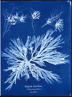
 I found it quite amazing that this is the technique used by Anna Atkins, who is said to be the first female photographer. While the process was first discovered by a scientist in 1842, Atkins was the one to bring it to photography, making a collection of them into a book of photogram ferns and seaweed

Here are my first two Cyanotype prints, done during the lesson. As you can see, they are quite dark.. in reality they aren't as dark as they appear here, but they are probably over exposed. They were done in daylight rather than the 'box' so it was a little harder to control and monitor. The third print I did, was exposed with the artificial light. I feel this one was a lot more successful as the colours are better. Also, this suited my chosen objects better as they weren't squashed by the glass in the frame. The light was able to work around the shape of the celery leaves, which brought out some tonal range whilst the above to images are very flat. I did leave the edges messy on purpose as I thought my subject matter was quite boring.
If I had more time, I would go back and do all of them with the artificial lighting. Also, I would rethink a 'proper' idea. I would love to try it with a negative. Maybe layering a couple of negatives?
I guess the theme of these works is organic objects, or 'edible trees,' as I have used baby spinach, parsley and celery leaves. I'd also like to try toning cyanotypes.
 |
A cyanotype “painted” with pastels - wow, maybe I could have done hand coloured cyanotypes! |
 | |
| A cyanotype toned in ammonia and tannic acid with a superimposed straight cyanotype print. |
 | |
| A cyanotype toned in tannic acid and sodium carbonate. |
 | |||||
| A straight cyanotype Water quality can change the colour of a Cyanotype. |
Grono Lamps!
So I did a bit of research and discovered that these lamps I am planning on using for my gel medium transfers have been decorated by many people! & not just the lamps, anything from ikea. They're called 'Ikea hacks' and there's even a website devoted to the 'hacking' of ikea products!
LINK:
http://www.ikeahackers.net/p/quick-start-guide-to-ikea-hackers.html
None of them I could find were using the gel medium transfer process but I found a lot of the results to be quite nice and a little inspiring . Most are simply pieces of paper stuck down with decoupage finish, glue or double sided tape, along with knitted covers and mosaics. Here are a few:
 |
| I Imagine I would get results similar to this. Perhaps more intense colours |

 |
| I really like the ones on the top row. Again, none are gel medium |
 |
| wow, love these :) |
Monday, 3 September 2012
Gel Medium Transfer Process
I have never even heard of this! I'm enjoying the alternative photographic processes we're being introduced to.
Part one (week 5)
I couldn't decide on two laser prints to bring in, so I brought about five. I'm still unsure about my photocopies. I did them in the City West library and thought they didn't look like laser picture quality. I asked the man at the desk who assured me they were laser photocopiers. The ink didn't smudge with wetness, but when I painted the gel medium on, I could see the ink shifting and the medium turned a pinky purple colour from the image underneath. So I'm interested to see how this turns out!
This is the photo I used for my first attempt that I took myself, at the Melbourne aquarium.

I really liked the example Di showed of her gel medium transfer onto mirror. I was excited to find out we could stick the transfers onto pretty much any surface we wanted. I considered old pieces of wood, glass, ceramic bowls and cups (as I am doing a ceramics elective). I think I have decided to put them on lamps. I have a 'Grono' table lamp from Ikea that I think would work well. I asked Di if she thought that would be okay. She said yes, but explained that the transferred image could melt if the lamp got too hot. I tested the lamp and after a couple of hours it got only the slightest bit warm. I think with the least powerful globes I can get, It'd be fine :)
This is the lamp:

(http://www.ikea.com/us/en/catalog/products/00029225/)
I think I would cover all four sides. I have been inspired by the blossoms just coming into spring time and might use some old photos I have of them.. (If I can find them)
Saturday, 1 September 2012
Hand Colouring
I have been looking forward to this assignment while kinda dreading it at the same time because I had no idea what to do with it. Especially after Di showed us such amazing examples! such as Kate Breakey, Holy Roberts and Nici Cumpston. I hadn't really seen much hand colouring examples before and was kind of left feeling intimidated, but was looking forward to giving it a go and seeing what everyone in the group came up with.
  |
| From: "small deaths' by Kate Breakey |
  | ||||||||||||||||||||||||
| 'Two Birds' and 'Young Girl Waking' - Holy Roberts |

Communicating a Unique Vision:
Hand Coloring Photographs
Hand Coloring Photographs
by Judith Monroe
I did a bit of research on the history of hand colouring and was surprised to find out that photographs have been hand coloured basically since photography was invented. Colour film didn't exist and it was the way they wouldn't make photographs look as close to the initial scene as possible. When colour film was invented, hand colouring practically stopped and people who coloured photos as a job were put out of work as they were no longer needed. Hand coloured photographs came back with a new intention - to not just take another colour photo but to communicate emotions that your average colour photo could not.
General 'rules' for printing and colouring photographs (although I believe it should be personal and experimental):
- Print photographs lighter than normal and with less contrast (lower number filter perhaps)
- Paper - use a pearl or matte finish. It will take the colour better and last longer
Subscribe to:
Comments (Atom)